Streamlit at It's Limits & Interactive Geospatial Visualisations
Dec 25, 2022
I recently built a somewhat involved dashboard based on the 2022 Malaysian General Elections as an exercise to learn
- Streamlit, and see how it scales with complexity
- Working with geospatial data
- Exploratory data analysis & visualisations on geospatial data at different levels of granularity
This post will cover the limitations I’ve encountered as well as a brief primer on how to get started working with geospatial data in Python.
Geospatial Data
GeoJSON
GeoJSON (Geographic JavaScript Object Notation) is an open standard format for encoding geographic data structures, based on JSON. It is commonly used to represent features such as:
- points
- lines
- polygons
As well as their associated attributes and metadata. It is widely supported in mapping libraries & GIS software.
parlimen.geojson
{
	"type": "FeatureCollection",
	"crs": {
		"type": "name",
		"properties": {
			"name": "urn:ogc:def:crs:OGC:1.3:CRS84"
		}
	},
	"features": [
		{
			"type": "Feature",
			"properties": {
				"state": "Perlis",
				"name": "P.001 Padang Besar",
				"code_state": 9,
				"code_parlimen": "P.001"
			},
			"geometry": {
				"type": "MultiPolygon",
				"coordinates": [
					[
						[
							[100.20513, 6.72227],
							[100.20778, 6.71931],
							[100.21202, 6.72057]
							// ... more coordinates
						]
					]
				]
			}
		}
		// ... more features
	]
}
In the above examples, we define each feature to be the geographical boundary of each parliamentary jusrisdiction or if you’d like to think about it more simply, a sub-state.
Metadata is stored in the properties field while the vertices of each polygon is stored as a tuple in geometry.coordinates as [long, lat]. You can probably imagine that recovering the shape of a polygon is simply connecting the dots between all vertices. As the name suggests, a MultiPolygon can contain multiple polygons for a single feature, which is useful when a particular region is disjoint geographically for instance.
Geopandas
Geopandas is an extension of the popular pandas library to allow for spatial operations on geometric types. In particular it integrates shapely for geometric manipulations & Fiona for I/O.
import geopandas as gpd

gdf = gpd.read_file("parlimen.json")| state | parlimen | code_state | code_parlimen | geometry |
|---|---|---|---|---|
| Perlis | P.001 Padang Besar | 9 | P.001 | MULTIPOLYGON (((100.20513 6.72227, 100.20778 6… |
| Perlis | P.002 Kangar | 9 | P.002 | MULTIPOLYGON (((100.16465 6.57050, 100.16618 6… |
| Perlis | P.003 Arau | 9 | P.003 | MULTIPOLYGON (((100.36581 6.48322, 100.36314 6… |
| Kedah | P.004 Langkawi | 2 | P.004 | MULTIPOLYGON (((99.79701 6.15851, 99.79812 6.1… |
| Kedah | P.005 Jerlun | 2 | P.005 | MULTIPOLYGON (((100.35617 6.44752, 100.35880 6… |
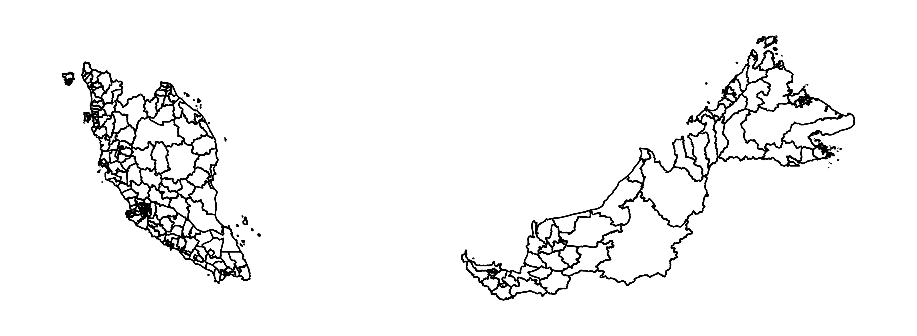
The same pandas operations available on pd.DataFrame objects apply to gpd.GeoDataFrame’s as well. You can come up with a simple plot via matplotlib immediately by calling the .plot() method directly on the GeoDataFrame object.
fig, ax = plt.subplots()
ax.axis('off')

# GeoPandas will look for the `geometry` column
gdf.plot(ax=ax, edgecolor="black", linewidth=1,color="white")
Plots
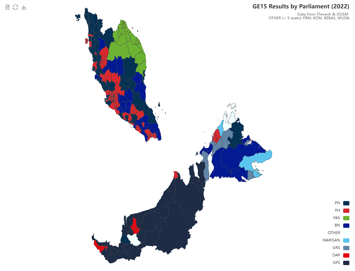
For the discrete choropleth of winning parties by jurisdiction, I decided to use ECharts instead of Plotly despite the trouble for the extra customizability. Luckily for me, popular Streamlit influencer Fanilo had already published a custom component to render these charts in Streamlit.

Data Preparation
You may or may not have noticed but I displaced East Malaysia significantly to the left and slightly downwards for a better vertical viewing experience. The way I did this is simply grouping each feature by it’s state then adding the corresponding constants to each latitude and longitude. This code is omitted.
If you are coming from a Python background haven’t made visualizations with raw Javascript before, this might be a little foreign. You’ll find that the API is alot more verbose than using packages like matplotlib and plotly. There is also a lot less auto-inference for things such as random color assignment for discrete variables.
For reference, checkout the this documentation page.
In particular, we need to prepare:
- The data
ECharts takes in the following shape
data : [
    {name: ..., value:...},
    {name: ..., value:...},
    ...
]
In our case, name is the unique identifier of each jurisdiction and value is the winning party’s name.
- A
visualMap
Since our value’s are discrete variables (winning party), we need a mapping of so that ECharts knows how to color each polygon.
winning_parties = [int(x) for x in data.value.unique()]
color = [id_to_alias_color[id]["color"] for id in winning_parties]- Tooltips
When hovering over a region, we want to display an informative tooltip for users to identify the jurisdiction, votes, etc. ECharts takes in a function for this purpose that takes in the hover event and expects HTML as the output.
function displayName(e) {
	return e.seriesName + '<br/>' + e.name + ': ' + e.value;
}
But wait, This is Javascript! st_echarts provides a utility for you to pass in minified JS. Yes, this is getting pretty inelegant 😂.
from streamlit_echarts import JsCode

tooltip_formatter = JsCode('function displayName(e){return e.seriesName+"<br/>"+e.name+": "+e.value}').js_code
Rendering the Chart
Putting everything together, firstly we need to define the options object which contains all the data & formatters we defined above.
options = {
        "title": {
            "text": "GE15 Results by Parliament (2022)",
            "subtext": "Data from Thevesh & DOSM \n OTHER (< 3 seats): PBM, KDM, BEBAS, MUDA",
            "sublink": "https://github.com/dosm-malaysia/data-open",
            "left": "right",
        },
        "tooltip": {
            "trigger": "item",
            "showDelay": 0,
            "transitionDuration": 0.2,
            "formatter": tooltip_formatter,
        },
        "visualMap": {
            "left": "right",
            "right": 0,
            "type": "piecewise",
            "categories": winning_parties,
            "inRange": {
                "color": color
            },
            "formatter": vmap_formatter,
        },
        "toolbox": {
            "show": True,
            "left": "left",
            "top": "top",
            "feature": {
                "dataView": {"readOnly": False},
                "restore": {},
                "saveAsImage": {},
            },
        },
        "series": [
            {
                "name": "Parliamentary Results",
                "type": "map",
                "roam": True,
                "map": "Malaysia",
                "emphasis": {"label": {"show": True}},
                "data": series_data
            }
        ],
    }
Then, instantiate a Map object with the GeoJSON data.
from streamlit_echarts import Map

map = Map(map_name="Malaysia",geo_json=geojson)
Display the chart in Streamlit via the st_echarts wrapper.
from streamlit_echarts import st_echarts

st_echarts(options=options, map=map)
HTML in Streamlit
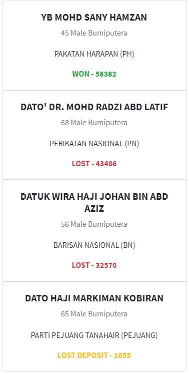
If you need a UI component that isn’t already built into Streamlit, such as a card, consider just writing HTML with f-strings!
def result_card(
    candidate_name: str,
    party_name: str,
    vote_count: int,
    result: bool,
    result_desc: str,
    candidate_age: int,
    candidate_sex: str,
    candidate_race: str
    ) -> str:
    lost_deposit = True if result_desc == "lost_deposit" else False
    return f"""
    <div class="card text-center">
        <div class="card-body">
            <h5 class="card-title mb-0 font-weight-bold">{candidate_name}</h5>
            <h6 class="card-subtitle mb-1 text-muted">{int(candidate_age) if not np.isnan(candidate_age) else "Unknown"} {candidate_sex.capitalize()} {candidate_race.capitalize()}</h6>
            <p class="card-text">{party_name}</p>
            <p class="card-text font-weight-bold {"text-success" if result else "text-warning" if lost_deposit else "text-danger"}">{"WON" if result else "LOST DEPOSIT" if lost_deposit else "LOST"} - {vote_count}</p>
        </div>
    </div>
    """
This HTML uses Bootstrap utility classes so we need to inject it’s CSS using the same trick you see below but instead with a <link /> tag.
Finally, the cards can be displayed using
st.markdown(result_card(**obj_kwargs), unsafe_allow_html=True) # heh
Deployment
Streamlit Cloud
Streamlit themselves provide a free cloud service. All you need is a GitHub repository containing the source code, a well defined requirements.txt. It also convieniently comes with continuous deployment, ie. the app will automatically be rebuilt upon changes to main.
I conjure that this is one driving factor behind their popularity. Note however the following limitations:
- Memory, GB. No free compute for your GAN’s and LLM’s!
- CPU, 1 vCPU
- Disk, Unknown but probably not much
- Your app will go to sleep after a consecutive period of no visits 😔
Still, pretty damn generous for a free option. At the time of writing, even VPS’s at this spec will cost you 4-6 USD.
Docker
Writing a Dockerfile for a Streamlit app is trivial as it is no different from other Python projects. This sample from the docs should be all you need.
From here, you can directly spin it up on a Linux server, forward the ports and ta-da. If you use Kubernetes, upload the built image to the a registry and spin it up as a regular ReplicaSet.
Conclusion
It’s clear that Streamlit is an excellent tool for expressing data & insights interactively rather than mundane static plots (they can be interesting too if done right!). The developer experience is truly fantastic when the components you need are already built into the ecosystem, either natively or through third-party packages.
As you’ve seen however, when you need something more custom things get hacky pretty quickly. Custom components typically wont fare well with theming & responsiveness as these details are abstracted away from us. The lack of fine-grained reactivity is a real deal breaker. Any change in state will trigger a complete rerender of the page, and theres no real way to fix this as well.
To a certain extent, st.session_state may be sufficient if all you need is to store state between rerenders, but it remains that you are unable to control when & which components are rerendered.
Naturally, these are fine tradeoffs for the simple APIs and are in fact beneficial for interating initial ideas & POCs rapidly. On the other hand if you’re looking to build something more complex, fall back to the Javascript ecosystem.
Appendix
Shoutout to
For the open data ❤️!
